
Color Coordination Without a Fashion Degree

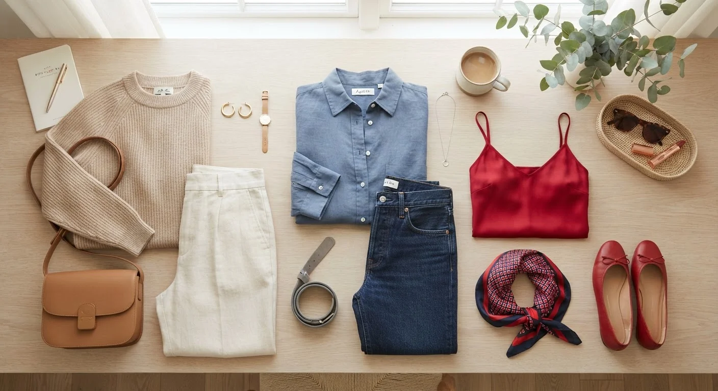
Photo: ConfiReads.com | Blogs For Inquisitive Minds editorial
Key Takeaways
- A neutral base makes almost any color combination easier to pull off.
- Tonal dressing - wearing shades of the same color family - is a fail-safe styling method.
- Contrast creates visual interest; too much of it can make an outfit feel chaotic.
- Understanding warm and cool undertones helps you choose colors that flatter your complexion.
- You don't need to memorize color theory - just three practical rules handle most situations.
Why Color Coordination Feels Harder Than It Is
Most people assume color coordination requires some innate artistic gift - or at minimum, a design school education. In reality, the stylists behind polished editorial looks are working from a small set of repeatable frameworks, not intuition alone. The reason outfits can feel randomly assembled isn't lack of taste; it's lack of a framework.
Color is one of the fastest signals your brain processes in an outfit. Before proportion, texture, or fit even registers, the eye reads color relationships. When those relationships feel harmonious, the whole look lands - even in simple pieces. When they clash without intention, even expensive clothes can look confused.
The good news: you can learn the core logic in under 20 minutes. What follows are the practical steps stylists actually use, stripped of jargon and ready for a real wardrobe.
What you will need
A color wheel (physical or app-based)
Helps you identify complementary and analogous color relationships at a glance.
Neutral anchor pieces (white, cream, beige, gray, black, navy)
Form the foundation of most easy-to-coordinate outfits.
A full-length mirror
Lets you assess the overall color balance of an outfit before leaving the house.
Smartphone camera
Captures outfit flat lays to spot color clashes or harmonies more objectively.
How to Put It Into Practice
Build Your Neutral Base
Start every outfit with at least one neutral anchor - a piece in white, cream, beige, camel, gray, navy, or black. Neutrals don't compete with other colors; they give bold or saturated pieces room to breathe. Think of them as the silence in music that makes the notes sound better.
If you're new to intentional color coordination, build full outfits around two neutrals first. A camel coat over a white shirt with light-gray trousers is already a polished, cohesive look with zero color risk.
Learn the Three Core Color Relationships
You only need three relationships to cover most outfit scenarios:
- Tonal: Shades of the same color family (dusty rose + burgundy + blush). Effortlessly elegant and nearly impossible to mess up.
- Complementary: Colors opposite each other on the color wheel (rust + teal, cobalt + burnt orange). High contrast, high impact - great for a statement look.
- Analogous: Colors sitting side by side on the wheel (olive + mustard + terracotta). Warm and harmonious, popular in earthy or seasonal palettes.
You don't need to memorize the wheel - just knowing these three frameworks gives you a decision-making shortcut whenever you're staring at your closet.
Understand Your Undertone (It Changes Everything)
Colors don't exist in isolation - they interact with your skin's undertone. Most people fall into warm (yellow, peachy, golden), cool (pink, red, bluish), or neutral territory. Wearing colors that share your undertone tends to make your complexion look more radiant and awake.
A simple test: look at the veins on your inner wrist in natural light. Greenish veins typically indicate warm undertones; bluish or purple veins suggest cool undertones; a mix points to neutral. This isn't an exact science, but it's a useful starting guide. For a deeper dive into matching color to your complexion, see our guide to shade matching and undertones.
Apply the 60-30-10 Proportion Rule
Interior designers use this ratio, and it works just as well for outfits: 60% dominant color (usually a neutral), 30% secondary color, and 10% accent. In practice, this might look like navy trousers and a cream blouse (your 60/30) with a terracotta bag as the accent pop.
The rule keeps outfits visually balanced without feeling flat. If everything feels off even when each piece is great on its own, proportion is often the culprit - a topic explored further in why outfits feel off even when the clothes are nice.
Test, Iterate, and Trust Your Eye
Color confidence builds through repetition. Start by recreating one combination you already know works - then swap one element and observe the shift. Over time, your eye calibrates naturally, just like a muscle strengthens with use.
Don't be discouraged by outfits that don't land. Even professional stylists discard looks before settling on the right one. The goal isn't perfection; it's developing an instinct you can trust. And remember: rules like these are starting points - as our style myths breakdown explains, many rigid fashion 'rules' don't hold up under scrutiny.
Use Your Phone as a Color Tool
Rules Are a Starting Point, Not a Cage
Avoid Matchy-Matchy Head-to-Toe Looks
Once you've worked through the steps above, you'll find that color decisions get faster and more instinctive. For putting these skills to work across different occasions and settings, our dress codes decoded guide is a practical next stop. And if you want to extend your color coordination into accessories - bags, belts, jewelry - how accessories change an outfit walks through each category in detail.
The content on this site is for informational purposes only and is not a substitute for professional advice. Always consult a qualified professional for guidance specific to your situation.